POLL: Vote for Wolves' best and worst ever kits
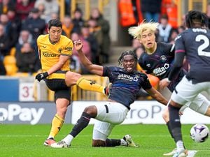
Wolves have unveiled their new home kit for next season - and most fans have given it a thumbs up.
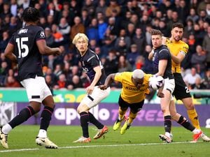
The pinstripe design - used for the first time since the 1980s - seems to be popular with supporters, whose main gripe is the Money Shop logo. A kit design is bound to split opinion.
And of the dozens of kits Wolves have produced over the years, some are far more popular than others.
Wolves correspondent Tim Spiers has picked out some of the best - and worst - kits worn by Wolves over the years.
THE BEST
1950s
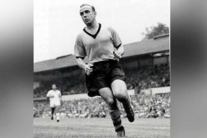
The definitive classic kit. Wolves beat all and sundry and conquered the world in a proper no-nonsense garment.
None of your fandangled outlandish trim, no logo, no sponsor, no yellow bar. Pure gold and black.
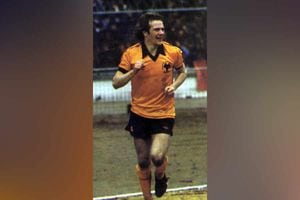
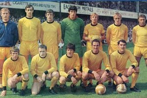
Mid-1970s
After adding a fancy logo in 1970 for the first time (although they had sporadically adorned a Wolverhampton coat of arms, as in the 1960 FA Cup final), Wolves produced an extremely popular ditty in the mid-1970s.
Umbro logo on the left, three sprawling wolves in the centre, 'WW' on the right (changed for the League Cup final to read 'Wembley 1974). Black collar, no messing.
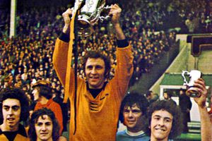
1979-1982
Technology allowed for synthetic fibres to be worn by the time 1979 came around. The Umbro logo remained, while a new wolf head was the club's logo.
Wolves' last shirt without a sponsor, and they won the League Cup wearing it in 1980.
1986-1988
Tatung were Wolves' first sponsor. Then came Benjamin Perry. But Staw Distribution, with the 'T' elongated across the top of the word in a fetchingly modern style, was the first fondly-remembered corporate conglomerate in Wolves world.
After four years of pinstripes, the faint two-shaded stripes were also a hit. And the kit coincided with Wolves' resurrection from the doldrums to the Second Division.
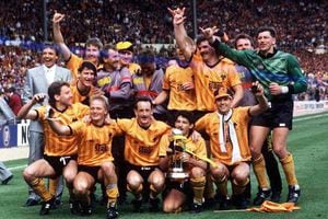
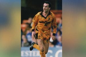
1994-1996
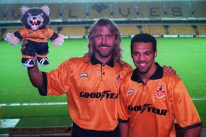
After a gentle easing-in period with Goodyear, Wolves enlisted the help of Nutmeg to produce a scorcher in the mid-1990s.
Back came the lesser-spotted Wolverhampton coat of arms and there was a pleasing lack of interference elsewhere.
The Goodyear sponsor, with a boot in the middle, was a roaring success for more than a decade.
THE WORST
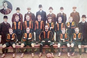
1888
There's no colour in the above picture, and it's probably just as well. For the first ever Football League season in 1888, Wolves wore red and white stripes. What were they thinking?
After what sounds like a quite horrendous kit clash versus Sunderland, they switched to orange and blue, and by 1892 had adopted Wolverhampton's municipal gold and black. The rest is history.
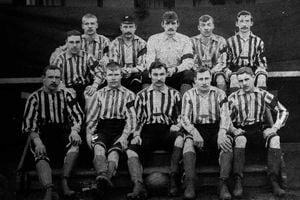
Early 1900s
The colours were there but they still didn't get it quite right in the design stakes.
From 1895 to 1922 thick, chunky stripes separated gold from black.
It's safe to say such heresy, seen as their fierce rivals adopt the same said stripes, wouldn't be considered now. Pinstripes are okay though.
1965-1969
Hmmm. No black shorts, Wolves? Really?
With Stan Cullis sacked the powers-that-be had a free rein to ditch tradition and do as they pleased.
Recreational drugs such as "LSD" were suddenly in fashion.
Whether Wolves' directors were on an "acid trip" when they plumped for an all-gold kit is unknown. But likely.
1992-1993
Early 1990s fashion - baggy trousers, floppy hair, etc - was dreadful.
Wolves played their part with a 'trendy' kit in 1992, joining forces with Goodyear to splurge tyre marks all over the sacred gold apparel.
Fans rebelled, organising a petition demanding the club ditch the bizarre stains.
It worked - the shirt was scrapped after a year.
1996-1988
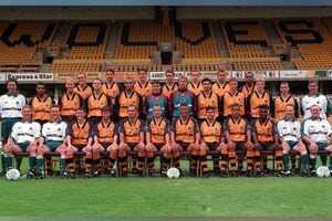
Popular with some, but hated by many.
There was just a bit too much black around the sleeve area.
And the inter-joining wolf-head template, while very snazzy indeed, was too much of a break with tradition.