Walsall Blog: The New Kit
Walsall blogger Mark Jones gives his thoughts on the Saddlers new kit for 2009/10 and draws some interesting parallels.

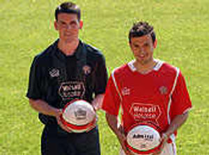
If you'd given me 100 guesses I would never have come up with Walsall Hospice as the new name on next season's shirts.
Quite naturally the initial reaction has been positive and it'll certainly be good for the club's soul to be seen to be supporting a local worthy cause.
OK so the tie up with an organisation like Walsall NHS Trust may be a reflection that there's not a lot of cash around at the moment, but fair play to them for trying to generate some positive publicity.
Wednesday's kit launch also saw the return to our shirts of Sign Specialists, from the early 1990's, this time in the guise of back sponsors.
Last time round they were quite a lucky charm, as three seasons from 1992-95 produced one play-off appearance and one promotion. That'd do me!
We've also returned to a 'name' manufacturer in Admiral, who I think made the famous '90 minutes from Europe' red, white and blue kit in 82/83.
This ought to guarantee a bit of quality for your £39.99 and it's got to be better than having other fans asking you why you've got a beaver on your shirt.
Another change is the return of the red shirt, which was also last seen in a promotion season, OK alright I can hear the sound of the bottom of a barrel being scraped too!
As someone who started supporting the Saddlers back in the 1970's, I've seen us switch between red and white/red a few times and I'm not particularly fussed either way, but it would be good if we stuck to one or the other for a length of time.
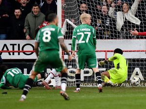
The away kit of green and black stripes might take a bit of adjusting to, but at least it's not the rhubarb and custard of a couple of years ago.
So those in charge have got the 2009/10 kit pretty much right, now let's see if they can get it right in giving the manager some proper backing in the summer.


